[WEB] 적응형 웹 디자인 vs 반응형 웹 디자인 vs 독립형 웹 디자인
우리가 흔히 통용되서 알고 있는 적응형 웹 디자인과 반응형 웹 디자인이란? 그리고 독립형 웹 디자인이란?
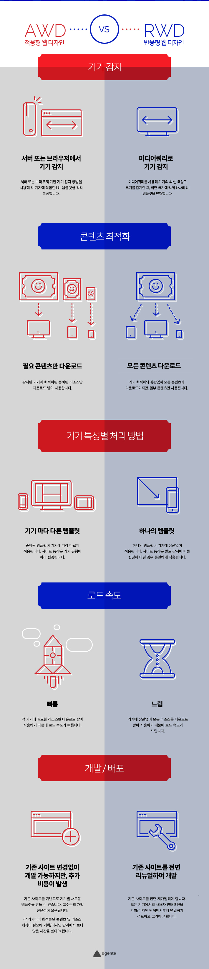
AWD(Adaptive Web Design) vs RWD(Responsive Web Design)
반응형 웹 디자인(RWD)는 미디어쿼리로 하나의 템플릿으로 사용자에게 컨텐츠를 제공하는 방식이고 적응형 웹 디자인(AWD)는 여러개 레이아웃에서 화면에 가장 적합한 레이아웃을 선택해서 컨텐츠를 보여주는 방식이다. 그리고 독립형 웹 디자인(SWD)은 모바일 환경일 경우 별도의 모바일 전용URL로 서비스 제공하는 형태이다.
Responsive Web Design
- 브라우저 창의 크기에 따라 콘텐츠가 동적으로 반응하여 최적화로 컨테츠를 보여주는 형태
A responsive website shows content based on the available browser space. If you open a responsive site on the desktop and then change the size of the browser window, the content will move dynamically to arrange itself (at least in theory) optimally for the browser window.On mobile phones, this process is automatic; the site checks for the available space and then presents itself in the ideal arrangement.
Responsive design is straightforward. Because it is fluid, it means that users can access your online world and enjoy as much of it on their handheld device as they would on a massive monitor. For this to be true, responsive design requires a very good conceptualization of the site and a deep knowledge of the needs and wants of the end users!
Adaptive Web Design
- 여러 개의 고정 된 레이아웃 크기로 가져서 사이트에서 사용 가능한 공간을 감지하면 화면에 가장 적합한 레이아웃을 선택해서 컨텐츠를 보여주는 형태
Where responsive design relies on changing the design pattern to fit the real estate available to it,
adaptive design has multiple fixed layout sizes. When the site detects the available space, it selects the layout most appropriate for the screen.So, when you open a browser on the desktop, the site chooses the best layout for that desktop screen; resizing the browser has no impact on the design.
In adaptive design, it’s normal to develop six designs for the six most common screen widths; 320, 480, 760, 960, 1200, and 1600 pixels.
Standalone Mobile Design
- 모바일 전용 웹 사이트를 만들어서 컨텐츠를 보여주는 형태 (일반적으로 URL에 “m”으로 구분한다.)
There is also the option to create a mobile-only website (these are usually denoted in the URL bar of a browser using the “m.” prefix).This option was once an excellent approach. Designers would create sites for mobile devices, attuning the elements and layout for a dedicated format. Google delivered search engine rankings to mobile sites, but today the same preferences are given to adaptive and responsive sites.
The big drawback of creating a separate site (rather than using different designs or employing a changeable design) is that it requires an awful lot more maintenance in order to keep the two versions of a website homogenous. With no particular incentive to do this, the mobile-only design has fallen out of favor in recent times. It seems unlikely that it will make a comeback anytime soon.
출처
- https://github.com/yamoo9/cj-olive-networks/wiki/적응형-웹-디자인-VS-반응형-웹-디자인
- https://www.interaction-design.org/literature/article/adaptive-vs-responsive-design